 |
 |
| Name: george Who is asking: Teacher Level of the question: Elementary Question: 1. What is the main difference between a broken-line graph and a histogram? Both represent continuous variables. 2. What is the correct way to read a multiplication array: x-axis first and then y-axis, other way around or it doesn't matter? Thanks
|
||||||||||
|
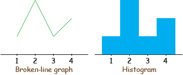
George, To make sure we are talking about the same graphs lets look at a small set of data. I have
and I drew what I would call a broken line graph and a histogram to represent the data.
In my mind the main difference is in what you are trying to emphasize. The broken-line graph shows the shape of the relationship between the X and Y values, the shape of the curve. The histogram emphasizes the area shaded in the histogram. Histograms are almost exclusively used in data analysis or statistics where you are representation some data set and you want to easily see some proportions or probabilities. For example you may have a dresser with 4 drawers numbered 1, 2, 3 and 4 (the X-values). In these drawers there are 7 shirts, 1 in drawer 1, 3 in drawer 2, 1 in drawer 3 and 2 in drawer 4 (the Y-values). From the histogram I can see easily that more than half of your shirt are in the first two drawers. In the broken-line graph I see the Y-values and have to add them but in the histogram I see the area in the first two bars is more than half the area. For your second question, whenever we have an array we mention the rows first then the columns. For example see the answer to a previous question. Penny |
||||||||||
 |
 |
 |
