| |||
| Math Central | Quandaries & Queries |
|
Question from Christine, a student: In a study of alcoholics, it was found out that 40% had alcoholic fathers and 6% had alcoholic mother. Forty-two percent had at least one alcoholic parent. What is the probability that a randomly selected alcoholic will |
Hi Christine,
I can get you started.
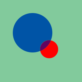
I would use a Venn diagram to approach this problem.

The green square represents all the families in the study. The blue circle contains the families with alcoholic fathers and the red circle contains the families with alcoholic mothers alcoholic mothers. The purple region is the overlap.
The region covered by the blue circle is $40\%$ of the area and the region covered by the red circle is $6\%$ of the area. The region covered by the blue and red circles together is $42\%$ of the area. What percentage of the area is in the overlap? What does that represent in terms of the families?
Penny
 |
||
Math Central is supported by the University of Regina and The Pacific Institute for the Mathematical Sciences.